Inspiration Article
At home with Heritage: nod to nature with the fresh colour palette curated by contemporary florist, Sage Flowers
In some circles, florists are the new celebrities, and such is the case of Iona Mathieson and Romy St Clair: the dynamic duo behind Sage Flowers in Peckham.
As we rediscovered our love of nature during the pandemic, and developed a new-found appreciation for the simple things (including the spark of pure joy a fresh bunch of flowers can elicit), the modern florist has developed quite the following thanks to its signature colourful, contemporary style. With neither founder trained in classic floristry, they are known for throwing out all the rules simply because they haven’t been taught them, and look to the beauty of nature for their bold displays. Enabling you to evoke the great outdoors in your own home, Sage Flowers was the perfect pick when it came to partnering with three creatives to curate their own palettes, all using the luxury paint in our Heritage Collection.
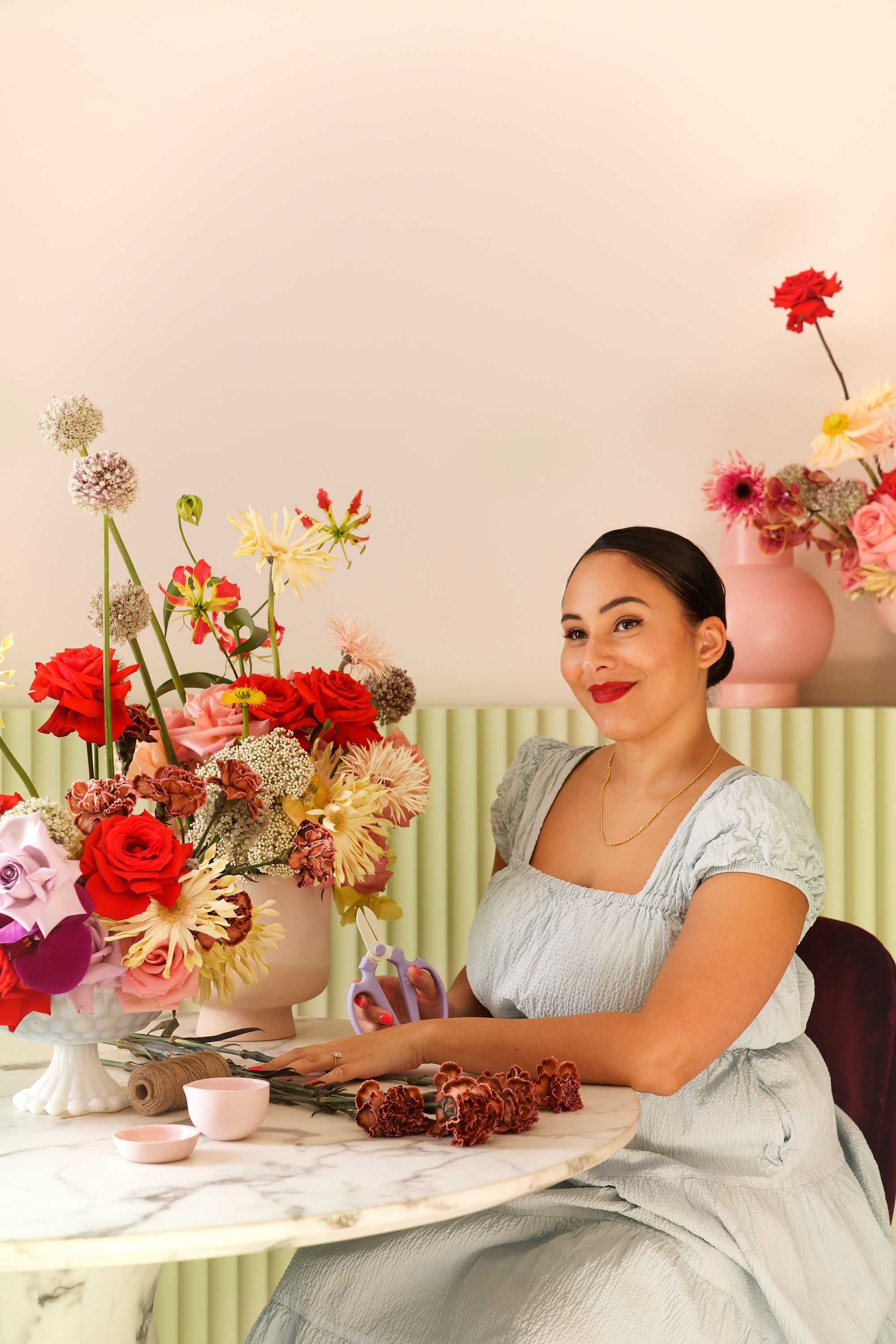
To champion the sensory quality of our colours – marrying classics from the past with the contemporary hues of today – and embrace the tactile nature of our paint, we collaborated with Iona and Romy to handpick a palette truly reflective of them. The result is a fresh and fragrant bouquet of pale shades that stir up emotions and awaken the senses – you can almost smell the flowers in bloom and hear the birds chirping.
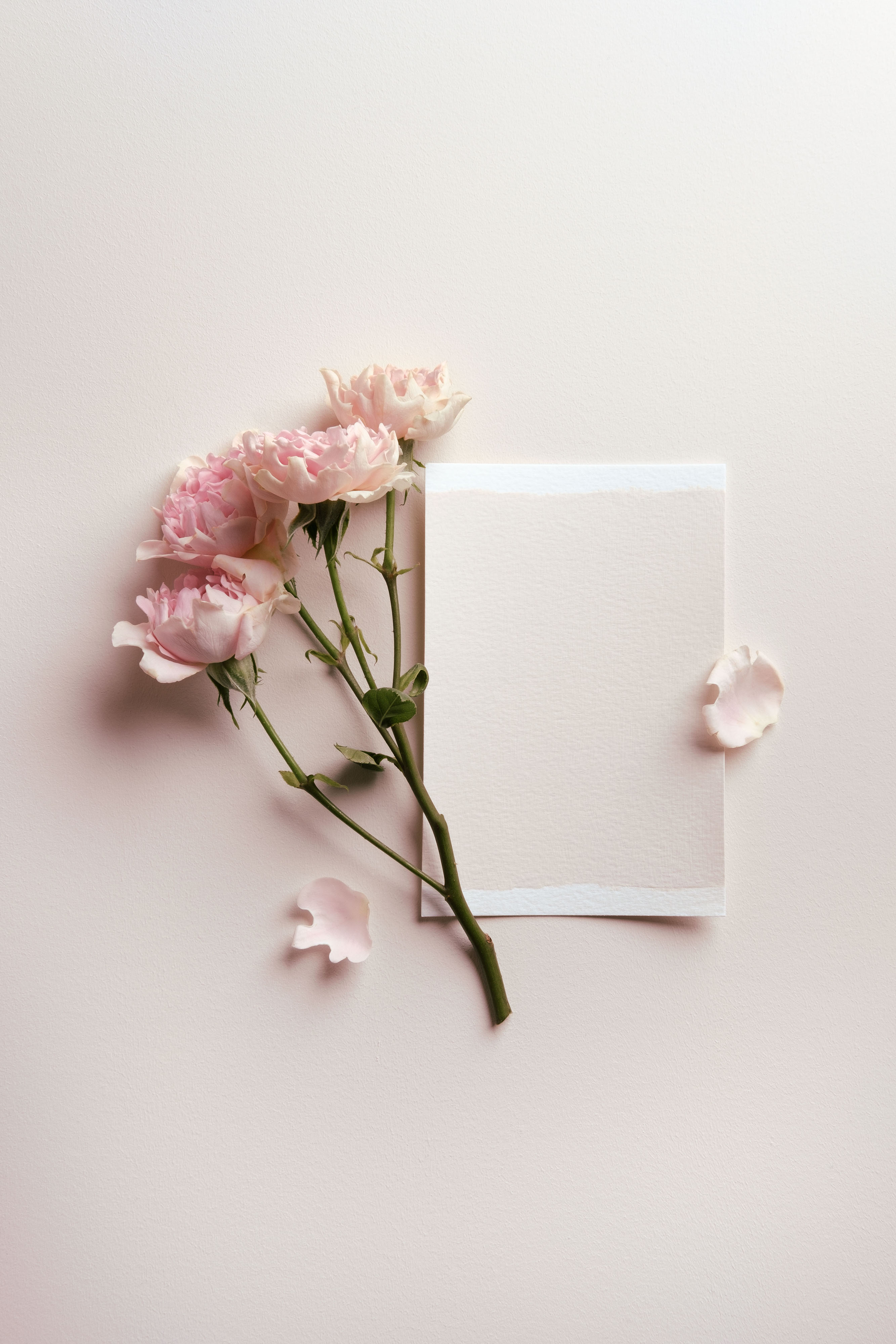
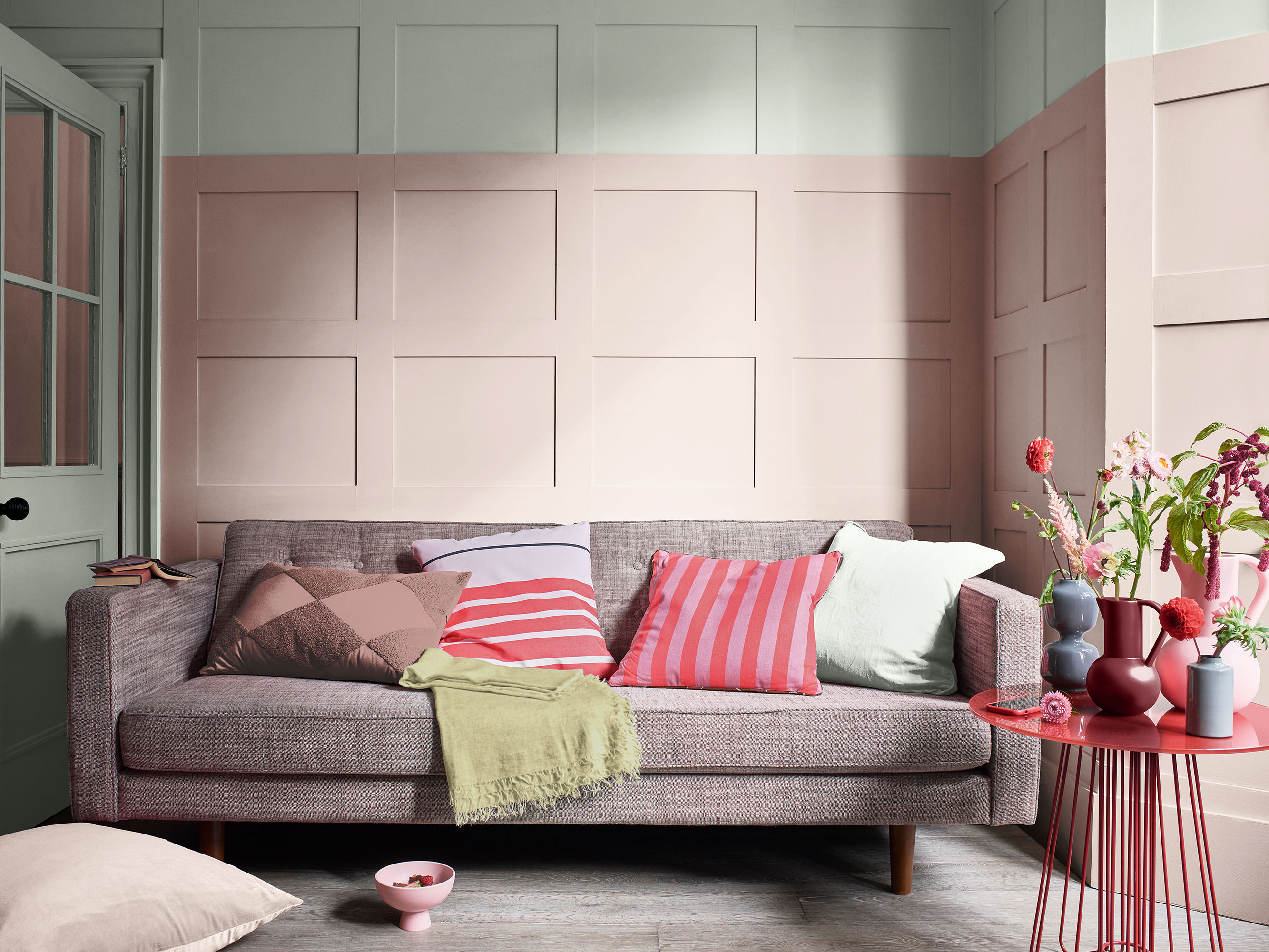
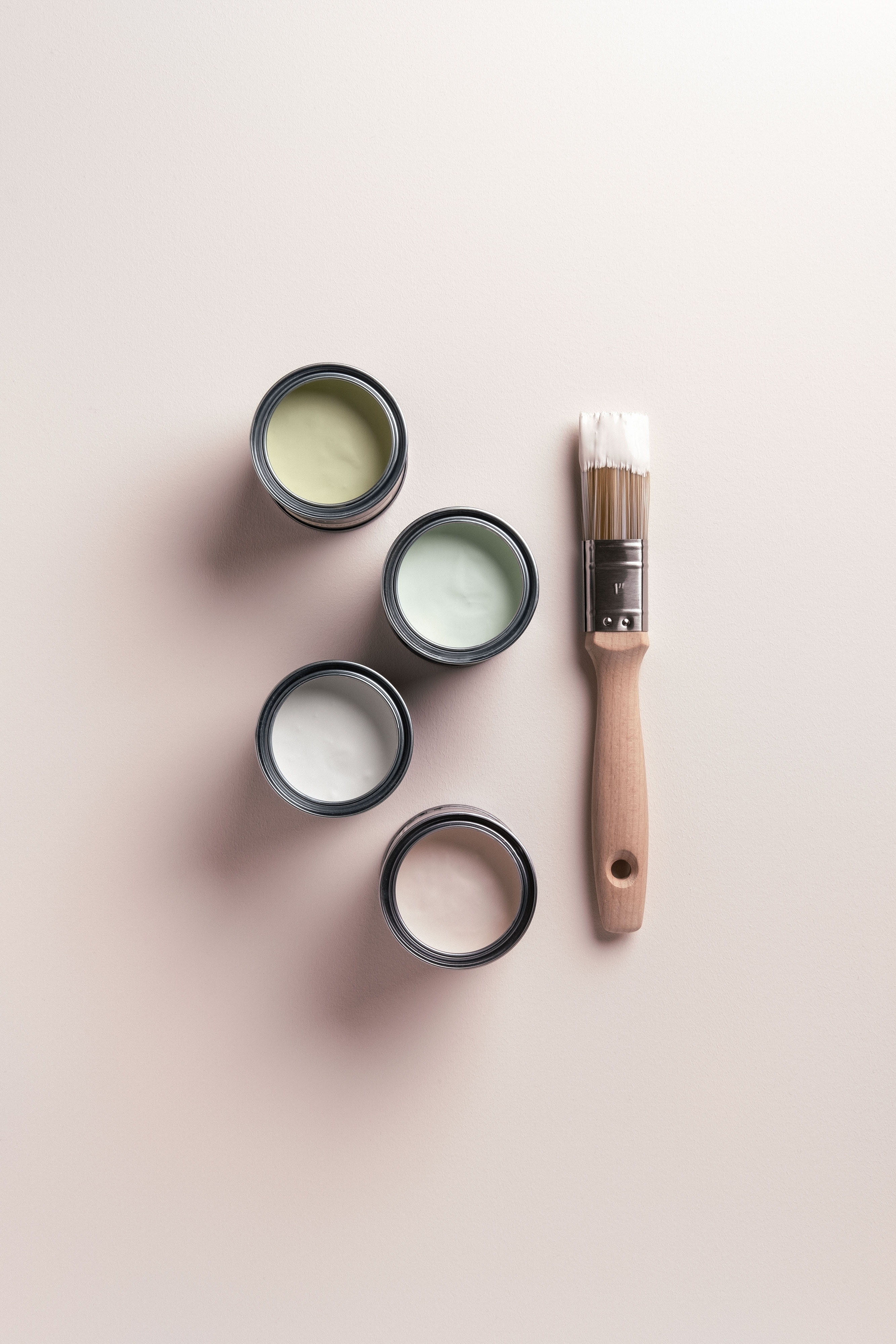
“Our colour palette includes beautiful pastel pinks, light olive greens and some baby blues – all signature Sage shades. It evokes romance, blousy summer weddings, and reminds us of sweet peas and garden roses,” muse the florists. Naturally romantic and whimsical – calling to mind all the warm scents of a summer’s day – they certainly have a nose for curating a pretty but practical palette. With just a hint of colour that can be used to gently lift spaces, the four dominant shades are Powder Colour, Pale Olivine, Fennel White and Mallow White, teamed with a wider palette of four additional hues: DH Blossom, Light Cobalt, Lavender Grey and Florentine Red. The harmonious combination makes the curation as accessible as it is aspirational, meaning recreating their look in your own rooms couldn’t be easier, with flex to add your own creative flourish, too.
Say Iona and Romy: “Our palette was inspired by our favourite projects – we’ve used flowers in these colours at summer weddings before – and we love how complementary they are and bring out the warmness in each other.”
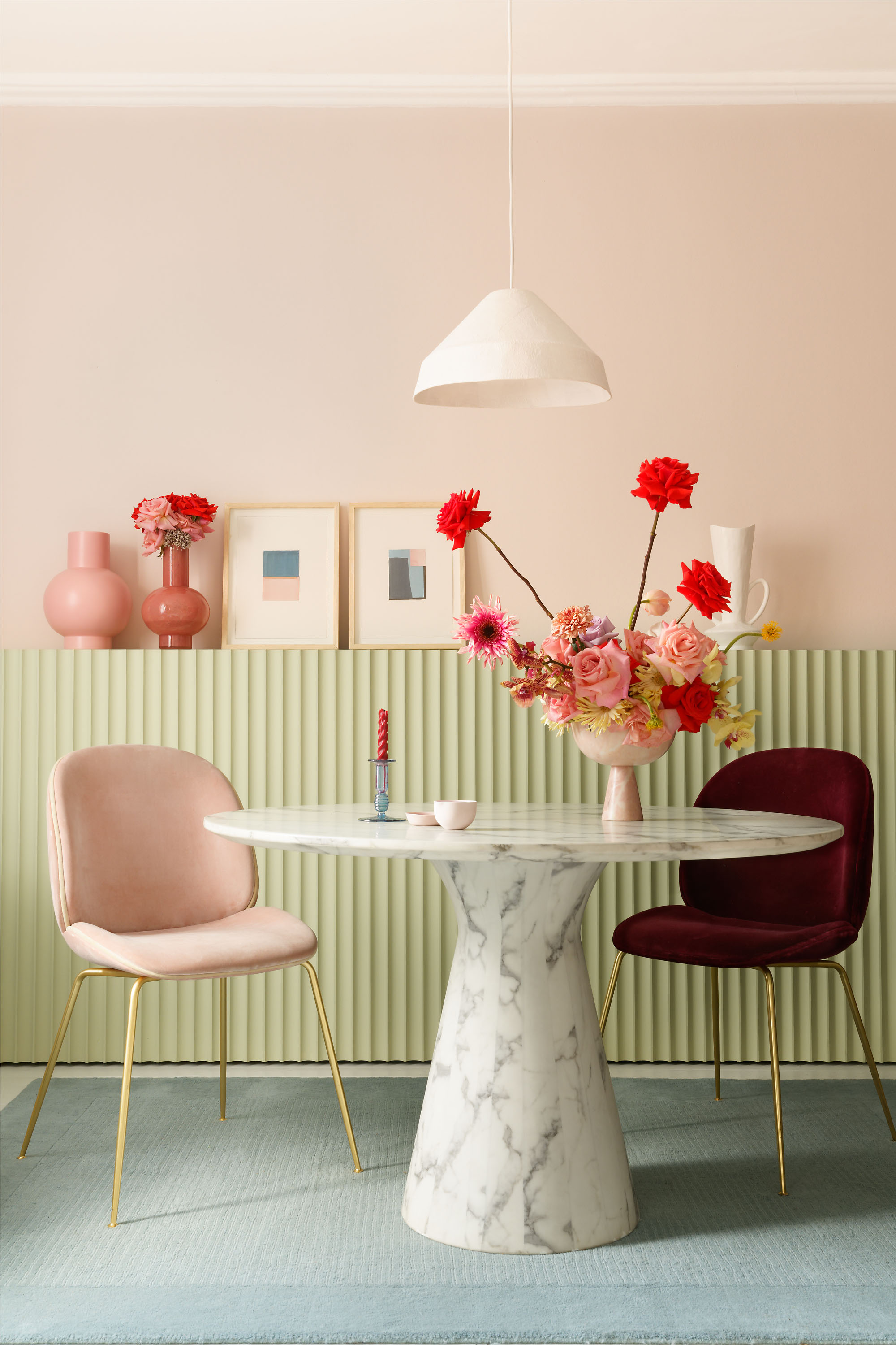
Of their signature pinks, Marianne Shillingford, creative director at Dulux, adds: “All pinks have become popular in the past few years but none so much as the blush-pink shades that capture the essence of what is to be happy and loved. It’s one of the subtlest hues of pink and creates a cosy atmosphere for when you want a welcoming look. It makes us feel young, happy, nurtured and warm.”
Soft and delicate, use the shades in the collection together for a layered and luxurious look that borrow elements from Mother Nature; or simply as pretty and feminine statements by themselves. Pick a pastel as the main colour: Powder Colour makes for a beautiful backdrop; then, much like assembling a beautifully balanced bunch of flowers, throw in an accent in a more dramatic shade like Florentine Red, and plump for woodwork in Pale Olivine. There are no rules, though – have fun, experiment, and find your inner florist.
To style up the palette, look to modern décor to reflect its contemporary nature, from furniture in bold shapes (curves are trending) and luxe materials such as marble and glass. Colour-wise, think about similar pastel shades: a rose-pink chair or a baby-blue table, for example. Finally, finish with accessories in brightly-coloured class or matte porcelain, and add a bunch of fresh flowers – stylish and structural, of course.
“Try to think about what you’ll have filling the rooms, such as the soft furnishings,” concludes Iona. “Ask yourself: what will complement my things?”
To build your confidence, use the palette in the playful manner the florists assemble their bouquets, starting with lighter tones and layering with bolder pops of colour. It’s the easiest way to introduce colour into a space without being overwhelmed – be empowered by nature, just like Iona and Romy.
With the muted and atmospheric quality of an English country garden, the palette is the perfect way to bring the outdoors in, and remain connected to the things that matter.
Browse for inspiration
Our carefully selected colours have been expertly curated into different tonal palettes to make finding your perfect shade easy. Divided into light, mid and deep tones, our free printed Colour Card is an intuitive tool to inspire your choices, with complementary hues arranged in harmonious columns and each paired with a beautiful white.
Commit to colour
Not only does Dulux Heritage look beautiful, but it feels gorgeous under your fingertips, with a Velvet Matt finish for walls and an Eggshell with a soft sheen for woodwork – try it today by ordering a Tester or commit to colour by choosing a can. What’s more, we promise our paint will give you the perfect colour with a uniform finish and the coverage stated, or we’ll replace it.
Share your ideas
Share the colour palette you have curated to reflect your own personality on social using #MyHeritageHome and tagging @DuluxHeritage – you could feature on our Instagram and Facebook pages.