Inspiration Article
At home with Heritage: create your own tastemaker palette
To celebrate the sensory quality of our shades – combining the classic colours of the past with the contemporary hues of today – we collaborated with three creatives to curate palettes that are a true expression of their characters using Dulux Heritage.
The result is a collection of three stylish palettes, all of them deliciously different, from the richness of The Restaurateur Palette by Ravinder Bhogal, to the luxury of The Interior Designer Palette by Christian Bense, and the whimsy of The Florist’s Palette by Iona and Romy from Sage Flowers.
Each tastemaker has been inspired by what’s important to them: Ravinder paid homage to her eclectic and exotic Kenyan heritage; Christian drew on his flair for the dramatic and his rebellion against white; and Iona and Romy were influenced by the projects they are most passionate about – including romantic summer weddings.
Inspired by our tastemaker palettes? There’s an art to creating your own. Marianne Shillingford, creative director at Dulux Heritage, says: “Decorating may be just a job, but colour is personal, and it’s colour that makes all the difference to the way we want to feel in our homes. Colour is a language of expression that can be deeply individual and meaningful. It reflects who we are, conveys what our style is, and makes how we furnish our interiors look amazing. Everyone has a palette of colours that’s unique to them and to find it doesn’t require hours scrolling through Instagram or reading countless interiors magazines – it starts in the heart with the things we love.”
From fashion to objets d’art and even food, here Marianne reveals how to curate your own by being inspired by what’s right in front of you – you simply need to know where to look…
1. Building blocks
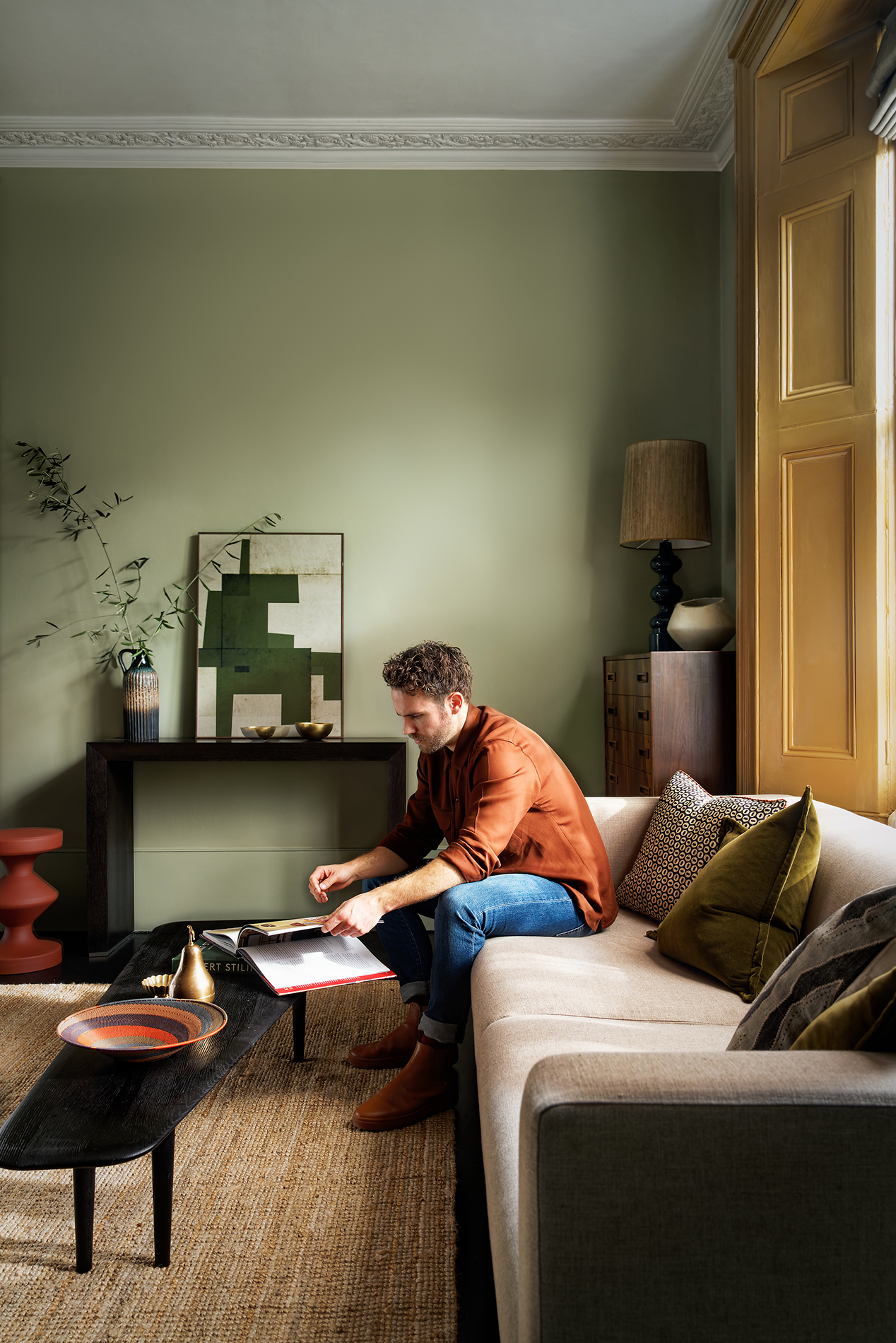
Where to start? “Amazing hotels, favourite restaurants and memorable holiday homes are brilliant sources of colour inspiration that evoke good memories,” says Marianne. “You can use the look and feel of your favourite places and spaces as a springboard for decorating schemes that capture some of your best moments and the simplest pleasures. Why not take a sneaky picture or two when you’re out and about and add them to your own personal colour lookbook as you begin to build a moodboard?” Don’t just look at painted walls, either, but accents on woodwork and windows, as well as how colours have been combined or contrasted. Then, admire how hoteliers, restaurateurs or hosts have layered colour using textiles, furniture and accessories, which often bring a palette to life by adding interest and depth. Remember: there are no rules, so consider complementary or clashing shades as much as perfect matches, just as interior designers do. Be bold and experiment.
2. Fashion advice
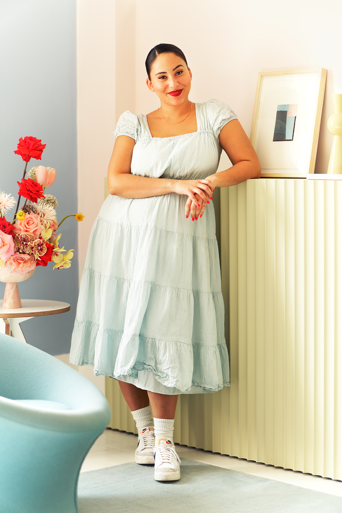
Next? Open your closet to unleash a catwalk of creativity. Explains Marianne: “Our wardrobes are probably one of the richest sources of colour that reveal who we really are and what makes us happy. We all have a palette of shades that makes us look our best and you can use your favourite outfits – the ones that help you feel your most gorgeous and confident – as inspiration to make your rooms look their best, too.” Indeed, a soft cashmere sweater in a cosy colour, or a summer dress in a pastel shade, can spark the imagination and set the wheels in motion for a palette that comes together as if by magic. Your orange skirt paired with a pink blouse look chic for the beach? Then add a splash of fun with the same combination in your dressing room. Your baby-blue trousers teamed with a crisp white shirt look dreamy for dinner? Throw the pairing together for a soft and soothing dining room. Dig deep into your style and consider the colours of your clothing to create spaces that are a true reflection of you.
3. Food for thought
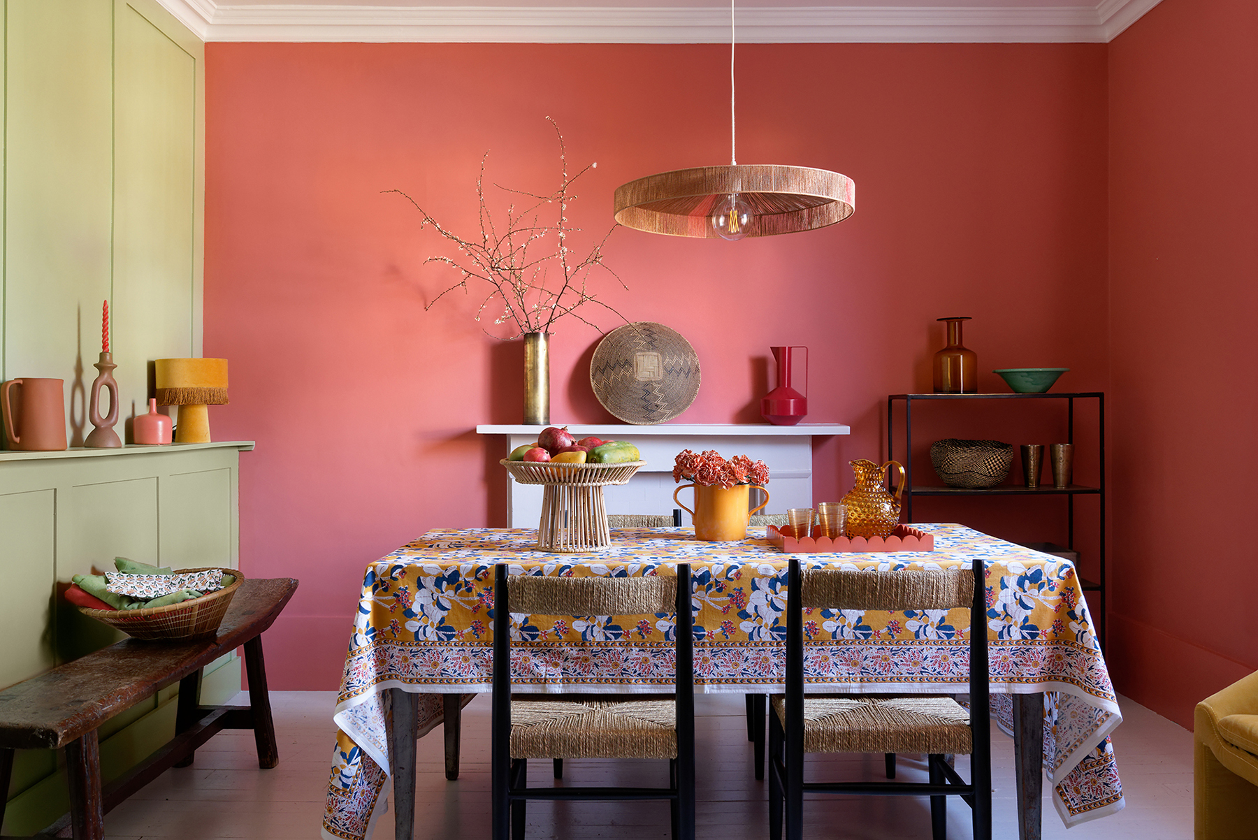
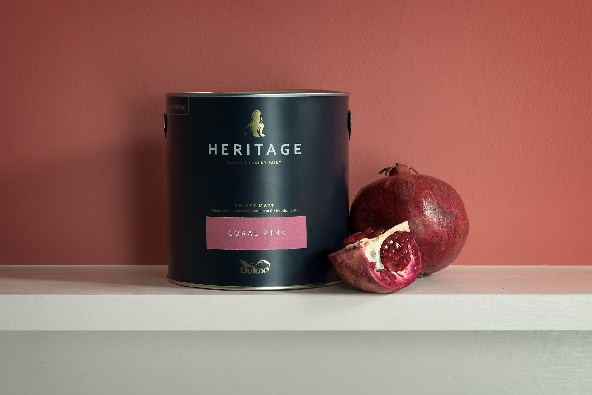
“We feast with our eyes. If something looks good, it’ll probably taste good, and it’s not just food that should be a delicious sensory experience,” says Marianne. “Colours can capture the essence of a luxurious treat on your tastebuds. Because our paint feels smooth and velvety under your fingertips, too, you can create an experience of colour that goes far beyond the way they look.” Think about the colours of your favourite dishes and how they would translate to your home décor and what impact those would have on the way you feel in each space. Consider lush greens bursting with vibrancy for relaxing and refreshing kitchens or dining rooms; and sweet pastels that capture the childlike quality of an ice-cream sundae for fun bedrooms and playrooms. Adds Marianne: “Red is a colour that helps to make food taste sweeter and conversation flow more easily in spaces where we eat and entertain, so if you want to encourage happier and more lively mealtimes, try a generous pinch of rouge!”
4. Nature calls
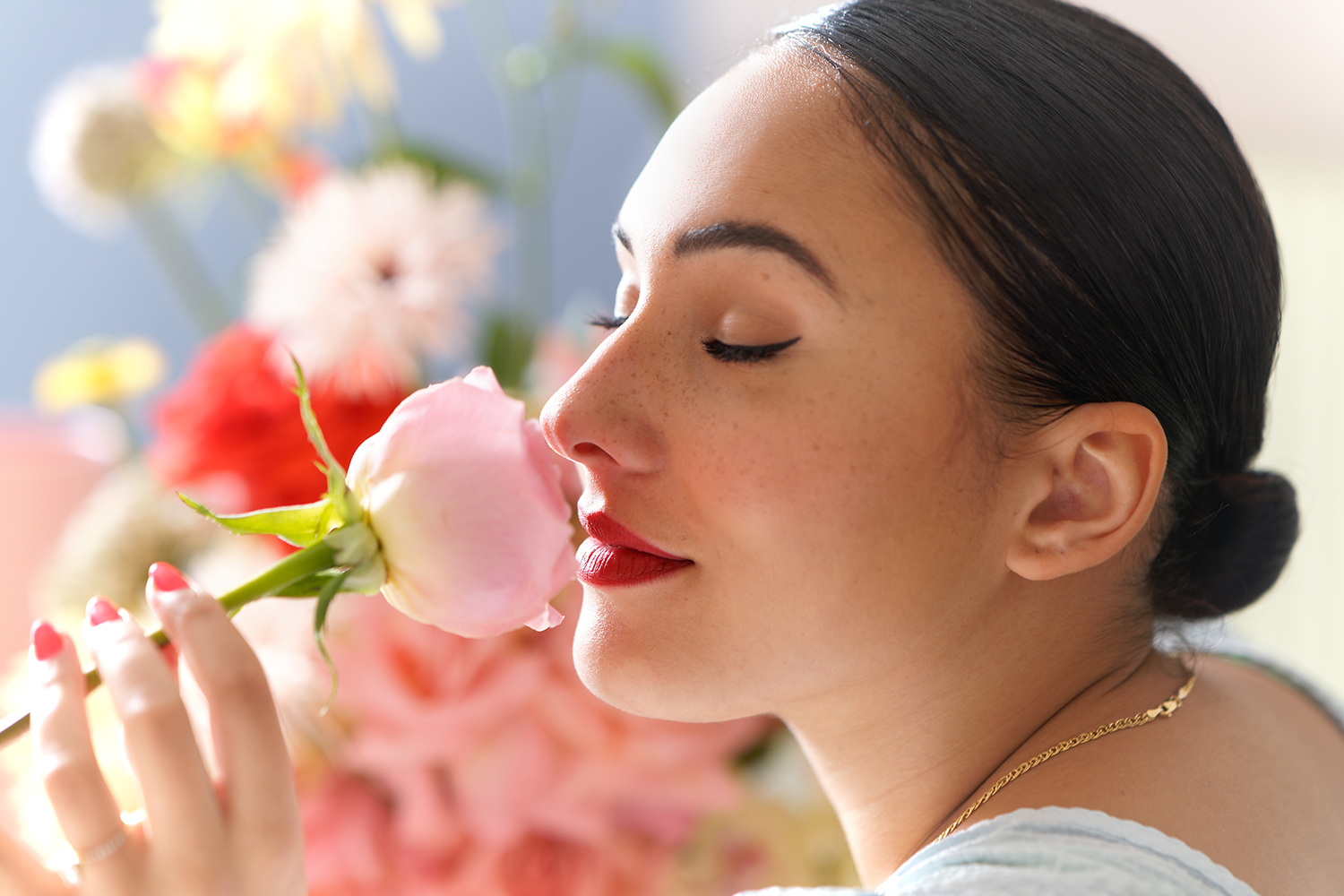
Finally, look beyond interiors to get inspired for your palette, starting with what’s right outside your front door. Marianne says: “There’s nothing that soothes the soul more than getting out into the countryside where we can be close to nature. It’s nature’s palette that has always provided the greatest source of colours we want to have on our walls, so it’s no surprise that 61 of the 112 colours in the Heritage Collection are inspired by the land, sea, sky and natural materials. From Ancient Sandstone to Country Sky, each carefully created hue takes us to a place where the benefits of nature help to create interiors that are relaxed, tranquil and beautifully familiar.” Start by admiring the organic beauty of plants and flowers, many of which change with the seasons to reveal an abundance of shades to select from; look out into your garden or outdoor space at the grasses, trees and stones – sometimes the most incredible spectrum of choice can be unearthed in the most unexpected of spaces; and travel further afield to soak up distant surroundings and bring inspiration home with you.
5. Memory bank
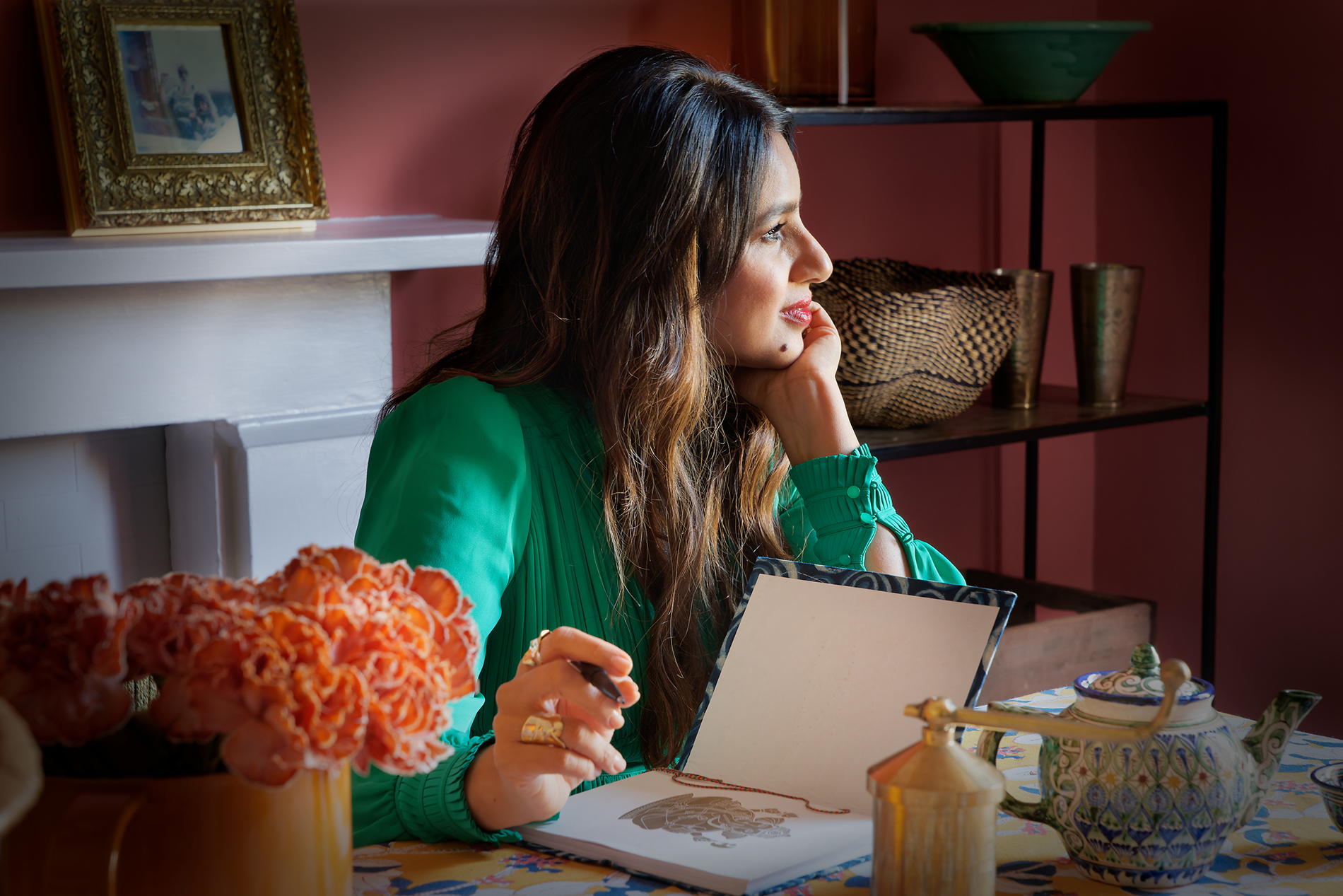
“Some of the most personal things we keep like photos, keepsakes and even memories are the most powerful forms of inspiration for the way we style and live in our homes,” says Marianne. “The colour of favourite matching dresses my sister and I wore as kids immediately takes me back to a time when life was simpler, and the sun shone every day in an endless summer. I use the same shades of pink and cream as often as I can in decorating and each time I use them I am a giggling, happy eight-year-old again. Colour and memory, just like taste and smell, take us gently by the hand back to places, people and things we love from the past. They are powerful and multi-sensory and we should always include a palette of these precious colours in our decision-making when it comes to decorating spaces that are truly unique to who we are.” So, take a leaf out of Marianne’s book, and think back to cherished times to inspire, whether it’s browsing through an old photo album to trigger memories, or rifling through a box of keepsakes that evokes moments. Otherwise, simply shut your eyes and think of the things that matter from times gone by, and allow your imagination to paint your palette…
Browse for inspiration
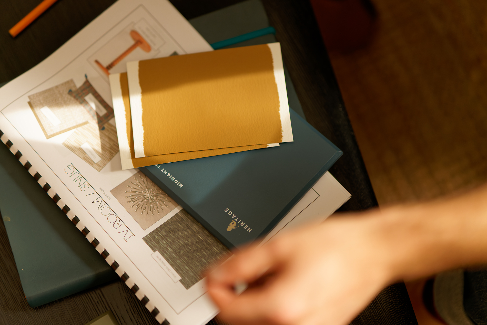
Our carefully selected colours have been expertly curated into different tonal palettes to make finding your perfect shade easy. Divided into light, mid and deep tones, our free printed Colour Card is an intuitive tool to inspire your choices, with complementary hues arranged in harmonious columns and each paired with a beautiful white.
Commit to colour
Not only does Dulux Heritage look beautiful, but it feels gorgeous under your fingertips, with a Velvet Matt finish for walls and an Eggshell with a soft sheen for woodwork – try it today by ordering a Tester or commit to colour by choosing a can. What’s more, we promise our paint will give you the perfect colour with a uniform finish and the coverage stated, or we’ll replace it.
Share your ideas
Share the colour palette you have curated to reflect your own personality on social using #MyHeritageHome and tagging @DuluxHeritage – you could feature on our Instagram and Facebook pages.
