Inspiration Article
At home with Heritage: celebrate the past with the modern colour palette curated by restaurateur, Ravinder Bhogal
Colour can recall a cherished memory, and nobody knows this more than restaurateur and writer, Ravinder Bhogal.
Born in Kenya, Ravinder has a rich and colourful heritage that doesn’t only inspire her London restaurant, Jikoni, but has been used to inform the rich palette she has curated using the luxury paint in the Heritage Collection.
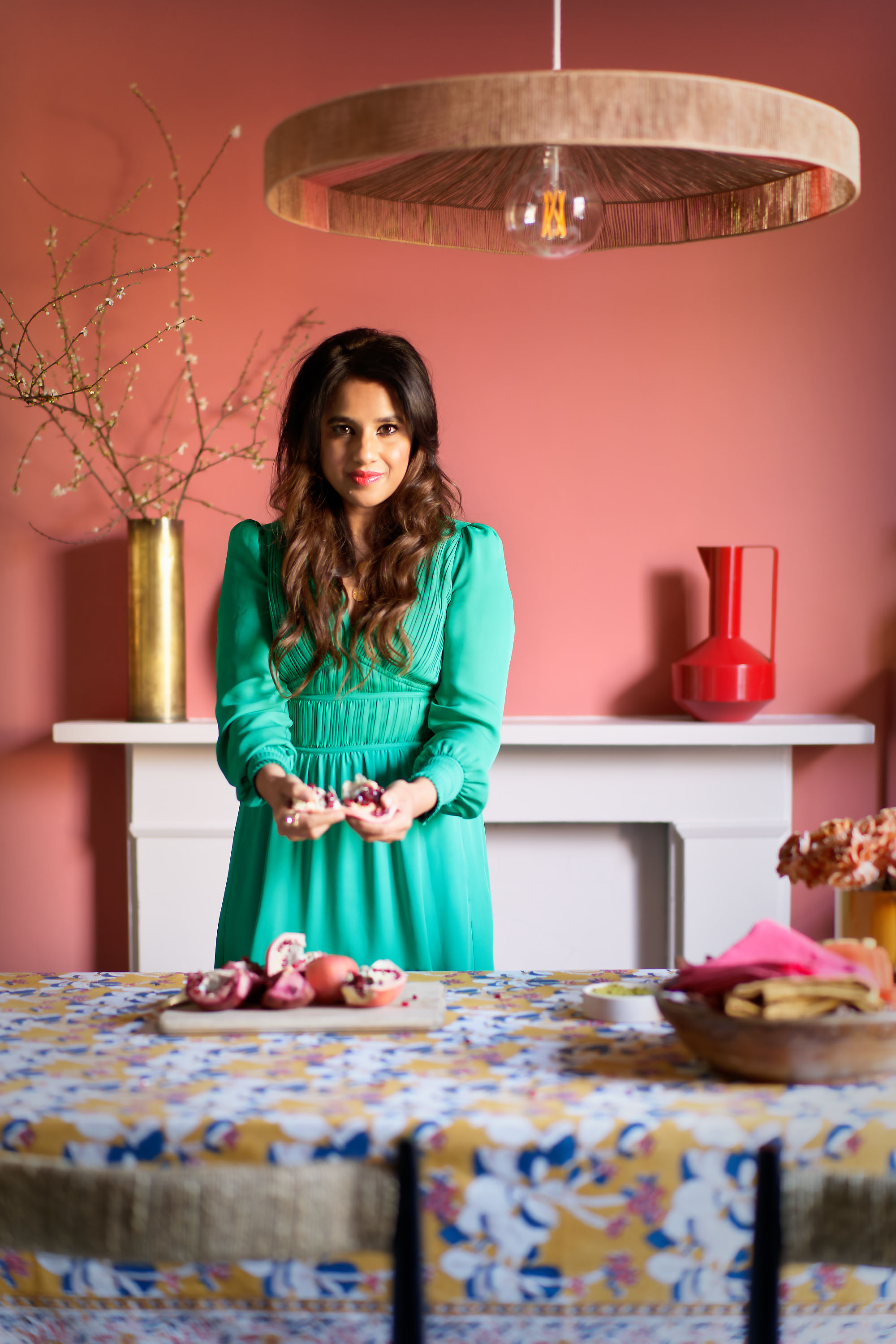
To celebrate the tactile nature of our velvety paint and the sensory quality of our timeless colours, we partnered with Ravinder to cherrypick a palette that is truly reflective of her personality. Each of the colours she has selected has a story to tell, which, in turn, will help you to tell a story in your own home.
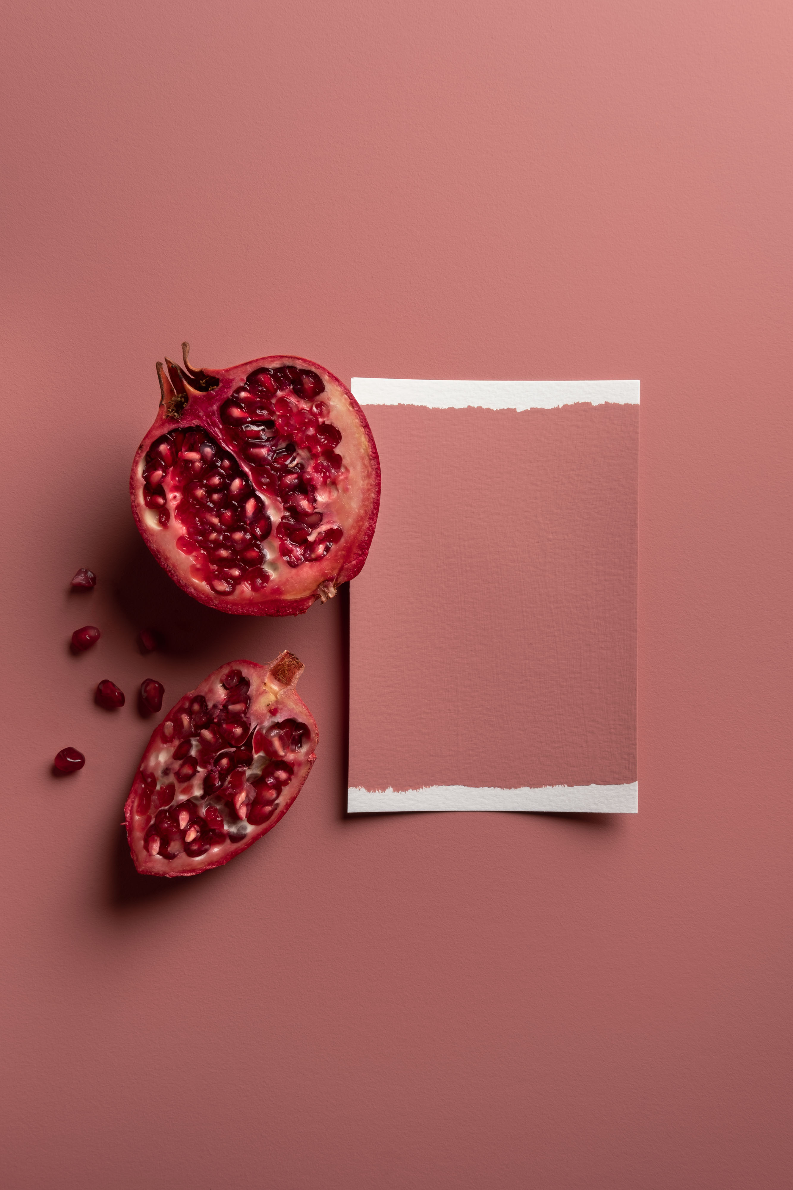
“My palette evokes a sense of my heritage,” explains Ravinder, “such as my family home in Kenya, the kitchens I grew up in and the sumptuous ingredients I love to use in my cooking.” Of her childhood home, Ravinder recalls the rich, volcanic red soil underfoot outside; a pistachio terrazzo floor in the house; and a guava tree in the garden that bore fruit with custardy-pink insides. “All these colours signify happy times,” she says, “and create a sense of familiarity and nostalgia.”
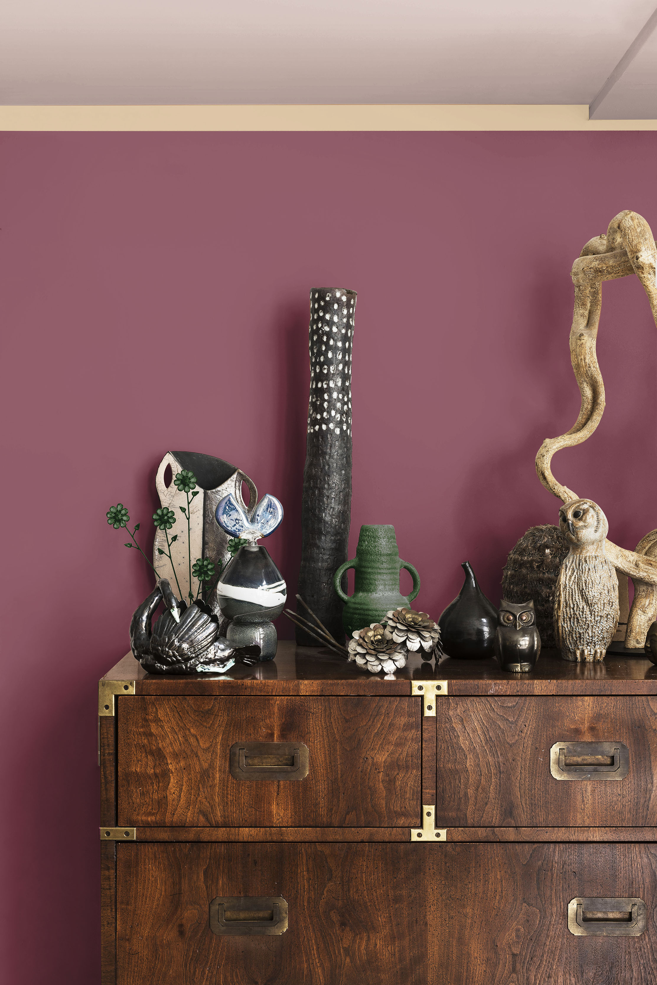
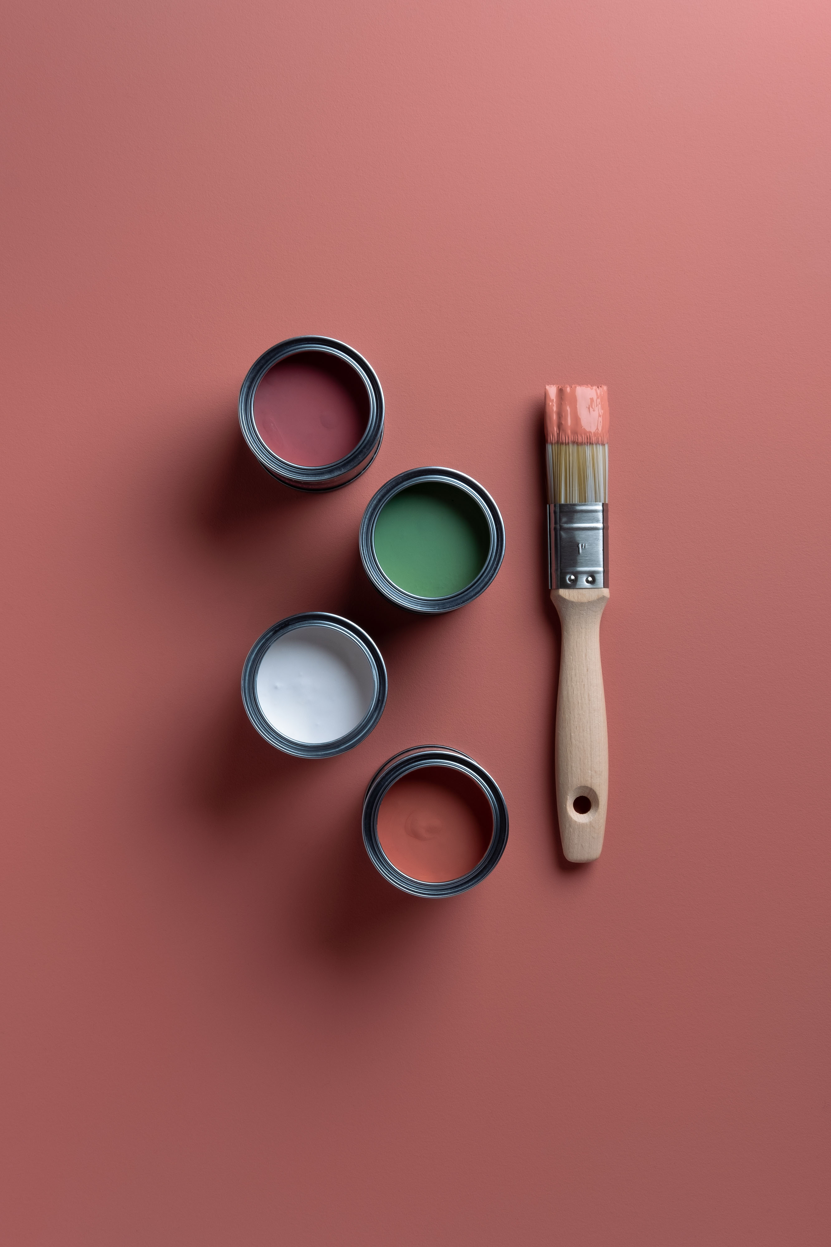
Deliciously rich and tastefully sumptuous, the nostalgic palette is collection of mid-tones inspired by treasured memories, creating a soft and seamless look on surfaces that’s almost good enough to eat. In her ‘recipe’, there are four dominant colours – Coral Pink, Fitzrovia Red, DH Grass Green and Marble White – paired with a wider palette of four additional shades. These are Pearl Barley, Brushed Gold, Potters Pink and Veranda Green – the ‘condiments.’ The combination makes the curation as accessible as it is aspirational, meaning it’s easy to recreate Ravinder’s look with scope to add your own creative stamp, too.
Marianne Shillingford, creative director at Dulux, says of Ravinder’s hero pink: “All pinks have become popular in the past few years, but none as much as the blush-pink shades that capture the essence of what is to be happy and loved. A flush of pink to the cheeks is often the first sign of attraction, and on the walls of our homes, this uplifting shade never fails to put a smile on our face – it makes us feel young, happy, nurtured and warm…”
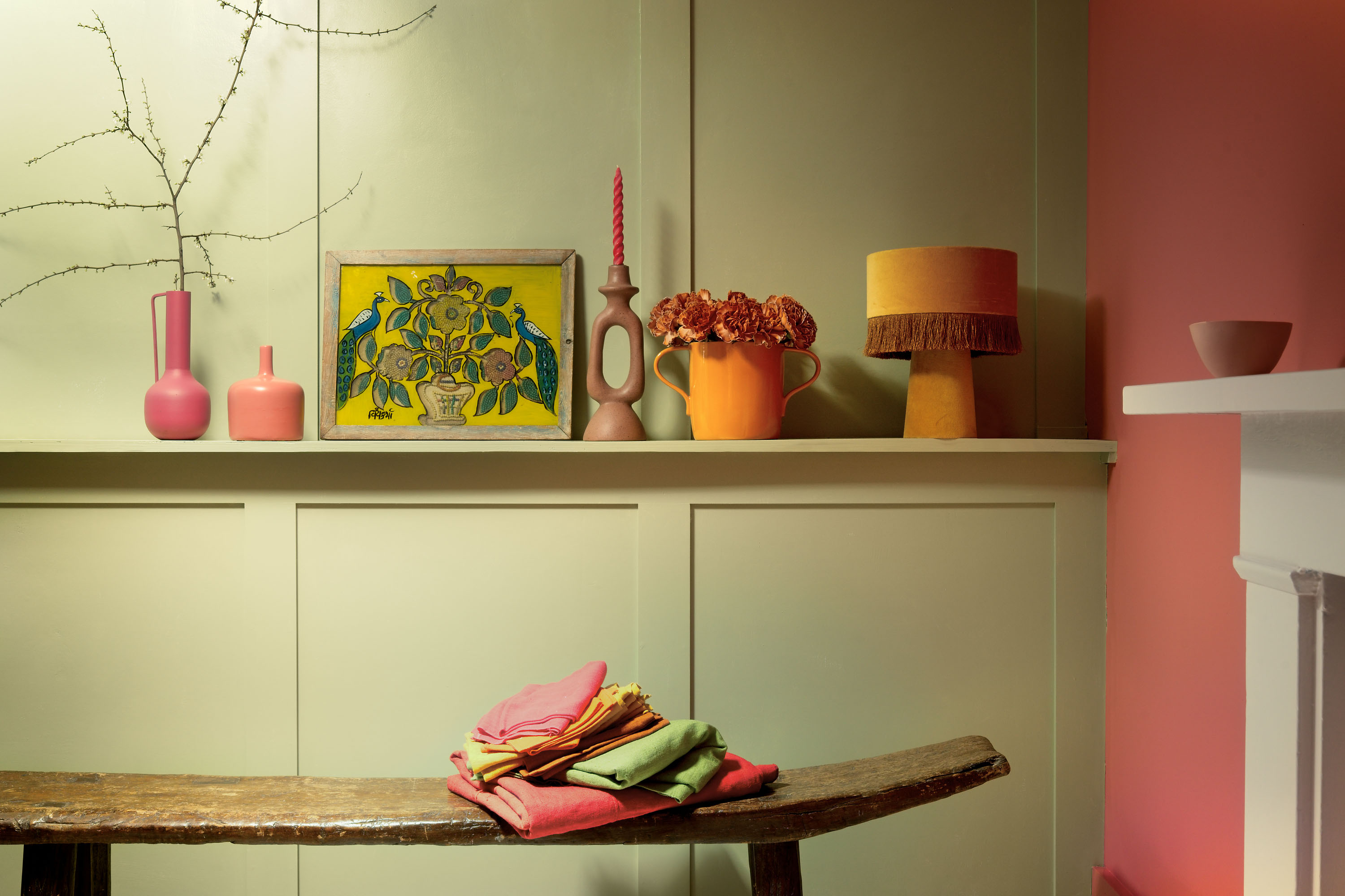
Both comforting and chic, with an eclectic bohemian edge to them, Ravinder’s hues are indeed homely and happy – “like a hug on the wall.” And much like the restaurateur’s love of layering, they can be used to spectacular effect together, or simply as bold, colourful statements by themselves. Consider each colour a star ‘ingredient’ – or a collection of ‘ingredients’ – depending on what it is you want to cook up in your space or what memories you want to evoke in your rooms.
“We have spent so much time in our homes, especially over the pandemic,” says Ravinder, “so I seek out warm colours that make me feel at home. I like tones that make me feel nurtured and uplifted.” Certainly, the earthy and natural shades in the restaurateur’s selection work to cocoon and console, which is exactly what everyone needs as we emerge from a challenging couple of years.
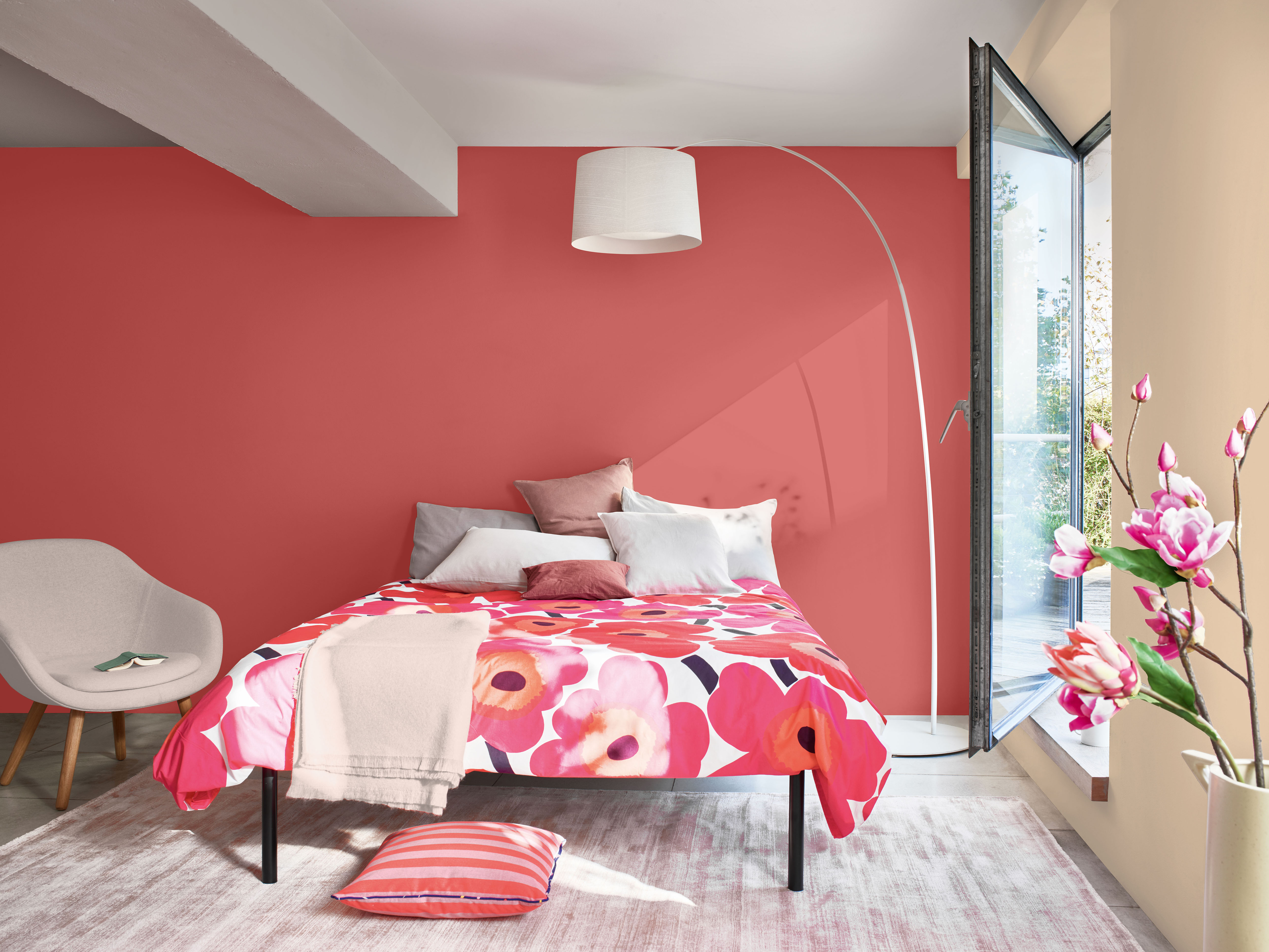
For Ravinder, more really is more when it comes to the finishing touches. She says: “I love a look that shows a life well-lived – something enduring and not trendy. I celebrate maximalism – treasured objects, hundreds of books, antique heirlooms…” So, to complement the colours, consider upcycled furniture, linen curtains, ornate textiles and vibrant accessories – this is about achieving an exciting and eclectic look, effortlessly. But with self-expression at the heart of the Heritage Collection, don’t be afraid to add your own individual touches, either. Use the palette as it is. Customise the colour combinations as you see fit. Or curate your own palette from scratch.
“The sense of heritage the paint has – the way it honours those who came before – and how tactile it is…” says Ravinder. “This is why I love Dulux Heritage.”
Browse for inspiration
Our carefully selected colours have been expertly curated into different tonal palettes to make finding your perfect shade easy. Divided into light, mid and deep tones, our free printed Colour Card is an intuitive tool to inspire your choices, with complementary hues arranged in harmonious columns and each paired with a beautiful white.
Commit to colour
Not only does Dulux Heritage look beautiful, but it feels gorgeous under your fingertips, with a Velvet Matt finish for walls and an Eggshell with a soft sheen for woodwork – try it today by ordering a Tester or commit to colour by choosing a can. What’s more, we promise our paint will give you the perfect colour with a uniform finish and the coverage stated, or we’ll replace it.
Share your ideas
Share the colour palette you have curated to reflect your own personality on social using #MyHeritageHome and tagging @DuluxHeritage – you could feature on our Instagram and Facebook pages.