Inspiration Article
At Home with Heritage: Three interior influencers curate their own colour palettes
Recently, we tasked three very different tastemakers to devise colour palettes that reflect who they are, while paying homage to the sensory quality of the shades in the Heritage Collection.
Blending the classic colours of times gone by with the contemporary hues of tomorrow, the paint in our range provided a blank canvas for the trio of creatives, and the result is The Restaurateur Palette by Ravinder Bhogal, The Interior Designer Palette by Christian Bense and The Florist’s Palette by Iona and Romy from Sage Flowers. All of them are completely unique and utterly beautiful. Ravinder’s evocative palette was inspired by her rich upbringing in Kenya full of exoticism and flavour; Christian was drawn to the dramatic schemes that have become a signature in his sophisticated palette; and Iona and Romy’s whimsical palette reflects their most creative and colourful projects from the past.
Here, we asked three influencers – all of whom caught our eye with their spectacular schemes on Instagram – to pick their favourite colours from the Tastemaker palettes, or simply to curate their own! Why not be inspired by their transformations and experiment with colour in your own home?

A debonair office of dreams
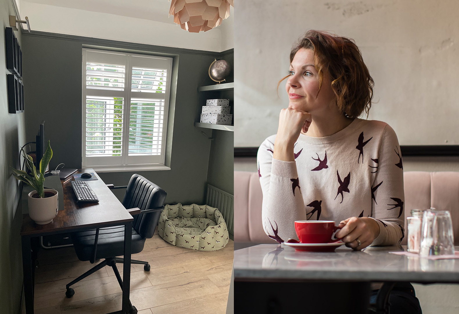
Lins is the brains behind Boo & Maddie – a lifestyle and home blog – and the personality at the helm of the @LinsDrabwell account on Instagram. Motivated by the dark and dramatic palette of Christian Bense, she styled up a home office for her husband in their 1930s house in South-East London, creating a refreshed space for both work and play.
Why did you want to change your space?
“When we moved into our home eight years ago, the small box bedroom at the back was the first space we completely renovated, turning it into a functional home office. We replastered the surfaces, replaced the windows, added new floors and installed smart shutters, making it a great room to use occasionally when we needed. Then, when we both had to work from home full-time during the pandemic, my husband took over and it no longer needed to work for both of us. So, I wanted to create a better use of the room, and this was the perfect opportunity to turn it into a more stylish home office.”
What inspired your colour palette?
“I’m naturally drawn to greens and already have a lot of paler shades around our home, but have never used a dark green to paint a whole room before. I’d seen some gorgeous room transformations on Instagram and Pinterest using more olive-toned shades and it inspired me to step out of my comfort zone. I narrowed my selection down to DH Slate and DH Drab, opting for DH Slate in the end as it was the darker of the two, and the small office room really lends itself to deeper colours.”
How does the colour palette make you feel?
“It sounds like a strange thing to say, but it makes me feel completely joyous, as I’m so pleased with the finished result. I’d never been brave enough before to paint the woodwork and radiator the same colour as the walls – daft I know, as it’s just paint at the end of the day! – but it works so well in this room. It has a traditional feel whilst also being a clean, modern shade – and I love the decadence. At the same time, the office hasn’t lost any of its cosiness, especially during the evening when it really comes into its own. It's almost as if the space now serves two purposes – somewhere to work during the day and somewhere to retreat to at night.”
How did you go about layering your palette with furniture and accessories?
“I knew I wanted to link the room to the others in the house by curating the same aesthetic. I continued the theme of green I have elsewhere, as well as the same wooden floors already installed in most rooms, adding a darker, industrial-looking desk for contrast. It’s a similar look to our coffee table in the living room and adds to the gentleman’s workspace I wanted to create. I switched out the existing plug sockets for black nickel, which match our kitchen, and installed some brass wall lights, plus neutral-toned styling on the shelf that both offsets and enhances the dark green walls.
What would you say to others looking for the confidence to curate a palette and change their space?
This project has given me the confidence to really go for it and step out of my comfort zone – I would recommend anyone to do the same. Think about a base colour you really love – in my case, green – and don’t be afraid to experiment with different shades of that base colour.”

A seriously luxurious lean-to
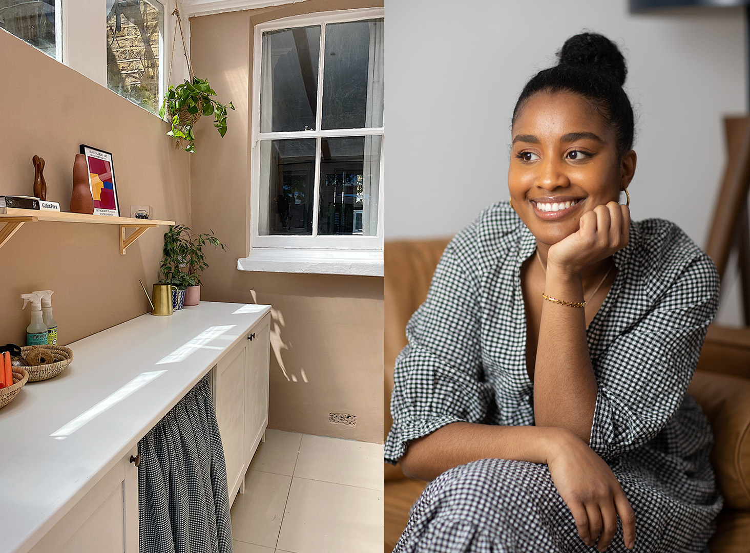
Self-styled as ‘ya fave pandemic renovator’, Nadine has been documenting her DIY on the popular @RonaRenovation Instagram account, and is fast becoming famous for her smart and savvy choices. Much like the palette curated by Iona and Roma from Sage Flowers, she sought inspiration in nature to transform a disused lean-to at her South London home, creating a gateway to the garden and carving out a luxurious utility at the same time.
Why did you want to change your space?
“Our lean-to area had been abandoned for way too long! We were piling things up in there, and not only was it a bad use of the space, but it was creating chaos in our otherwise serene home."
What inspired your colour palette?
“The lean-to acts as the bridge between the house and garden so I was keen on keeping the colour palette as earthy and natural as possible. I wanted shades that evoked a sense of peace, emanated warmth, and would complement greenery and plants.”
How does the colour palette make you feel?
“In short, serene and playful!”
How did you go about layering your palette with furniture and accessories?
“As I wanted to transform the space into a functioning utility, I had to consider two things. Firstly, that it was a small, narrow room with heavy foot-traffic; and secondly, that everything had to be done on a tight budget! So, I sourced white kitchen cupboards from the high-street that we assembled ourselves, and added a vinyl worktop. Mid Umber makes such a statement as the hero wall colour, so I wanted furnishings to look neutral, but not sterile. Chiltern White™ was the perfect complementary shade for the cupboards to give the room character. A friend of mine sewed us a ‘curtain door’ from gingham fabric to hide our ugly washing machine which feels fun and ties the scheme together. Finally, I accessorised an affordable pine shelf with personal trinkets and eclectic artwork.”
What would you say to others looking for the confidence to curate a palette and change their space?
“Think about how you want the space to make you feel, and work backwards from there. Colour palettes are ultimately emotive, so if you want to create calm, start pulling together a neutral palette. If you want a room to feel playful, primaries or colour pops may work. Then consider what furnishings you’re working with. Your forever pieces still need to suit the space, so sample lots of shades to ensure your palette complements your existing style.”

A beautiful bedroom sanctuary
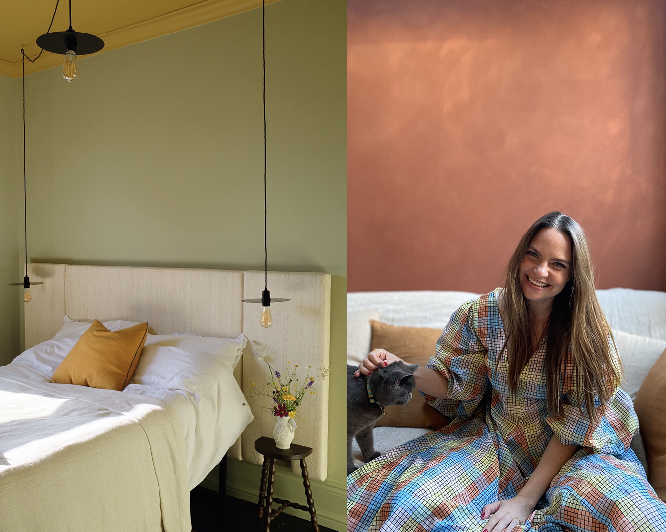
Jess is the journalist posting from the much-loved @JessAlaviEllis Instagram account and has used her knack for words and eye for interiors to garner an army of fans. Like our tastemaker Ravinder Bhogal, she used The Restaurateur Palette to evoke her own heritage, and create a sanctuary in her bedroom at her home in North London.
Why did you want to change your space?
“We’d worked so hard over several months transforming our master bedroom as part of our renovation, but had only half-finished, as it always got pushed down the to-do list. The chance to get creative with one of the tastemaker palettes inspired us to finally get the job done! I can’t believe we waited so long – the space is a wonderful sanctuary now.”
What inspired your colour palette?
“Dulux Heritage asked us to design a room that took inspiration from the The Restaurateur Palette curated by Ravinder Bhogal to evoke memories of her childhood growing up in Kenya. Veranda Green and Brushed Gold spoke to me as they remind me of own heritage and the landscapes of Jordan.”
How does the colour palette make you feel?
“Content: I love to decorate based on memories as it gives a totally unique and personal feel to every room.”
How did you go about layering your palette with furniture and accessories?
“I spent many of my daughter’s nap times making a bespoke oversized headboard from raw silk. I added framed pressed flowers from my garden and included vintage pieces like an antique bobbin stool, teak mid-century mirror and wardrobe handed down from my husband’s grandfather."
What would you say to others looking for the confidence to curate a palette and change their space?
“Think about how you want to feel in the space. Inspired? Calm? Joyful? Relaxed? Then think back to a time you felt that way – I find looking at photos helps. What colour was the sky? The scenery? Have a look at the Colour Card – do you see a match? Order some Testers and paint them onto big sheets of paper; try different combinations and move them around the room. In my opinion, the best rooms remind you of your favourite memories.”
Browse for inspiration
Our carefully selected colours have been expertly curated into different tonal palettes to make finding your perfect shade easy. Divided into light, mid and deep tones, our free printed Colour Card is an intuitive tool to inspire your choices, with complementary hues arranged in harmonious columns and each paired with a beautiful white.
Commit to colour
Not only does Dulux Heritage look beautiful, but it feels gorgeous under your fingertips, with a Velvet Matt finish for walls and an Eggshell with a soft sheen for woodwork – try it today by ordering a Tester or commit to colour by choosing a can. What’s more, we promise our paint will give you the perfect colour with a uniform finish and the coverage stated, or we’ll replace it.
Share your ideas
Have you used one of the tastemaker palettes? Share on social using #MyHeritageHome and tagging @DuluxHeritage – you could feature on our Instagram and Facebook pages.